

.svg)
Creating a Category-Shifting Brand Strategy and Identity
Form, previously known as NKD Ambitions, is a non-invasive medical aesthetics clinic in Canada. In 2019, as the business launched, the goal was to build a brand that could stand out in a rapidly growing, culturally complex, and often misunderstood industry. Their services were high-value and deeply personal. Success required more than a new look. It called for trust and a position strong enough to lead the category rather than sit quietly within it.
The process began with a fundamental shift in perspective. Form needed to be positioned not in the shadow of plastic surgery, but in alignment with the booming self-care movement. Understanding the nuances of the medical aesthetics industry was essential, including rising demand among millennials, growing interest from men, and the needs of LGBTQ+ clients who are often underserved in clinical settings. Alongside industry research, surveys, interviews, and audience deep dives revealed where the category was falling short. People were interested in treatments, but many felt left out, unsure, or judged by the current experience. There was confusion around what services were, stigma surrounding them, and a perceived lack of accessibility.
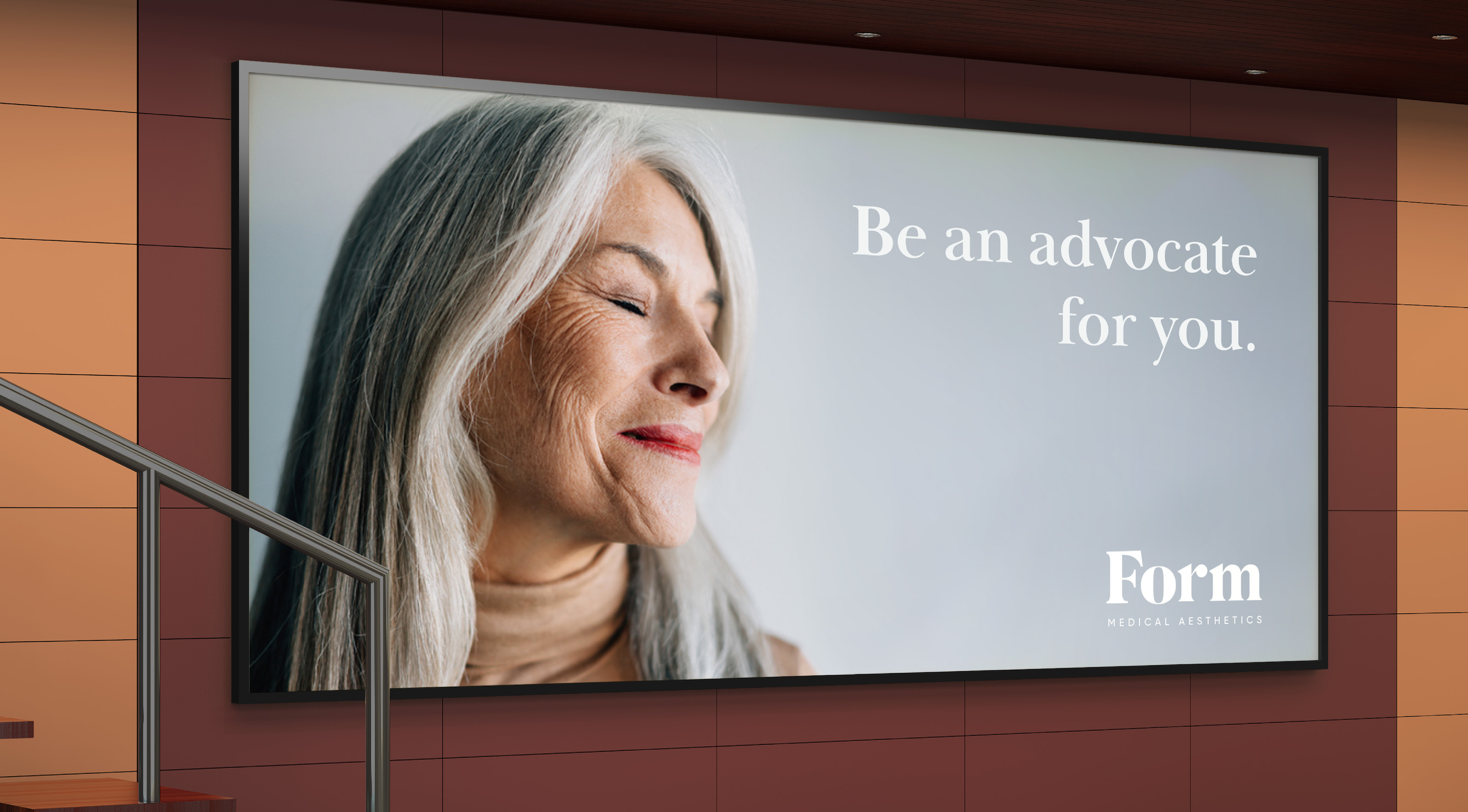
The brand needed to do two things: educate and empower. The name NKD Ambitions did not reflect the care, nuance, or trust people were looking for. A new name was required, one that spoke to both transformation and openness. From that insight, the name Form emerged. Form suggests fluidity and strength. It reflects how individuals shape themselves and how they are shaped by their experiences. As a brand, it offered an elegant, modern androgyny that could resonate across age, gender, and identity. It invited exploration, not perfection.
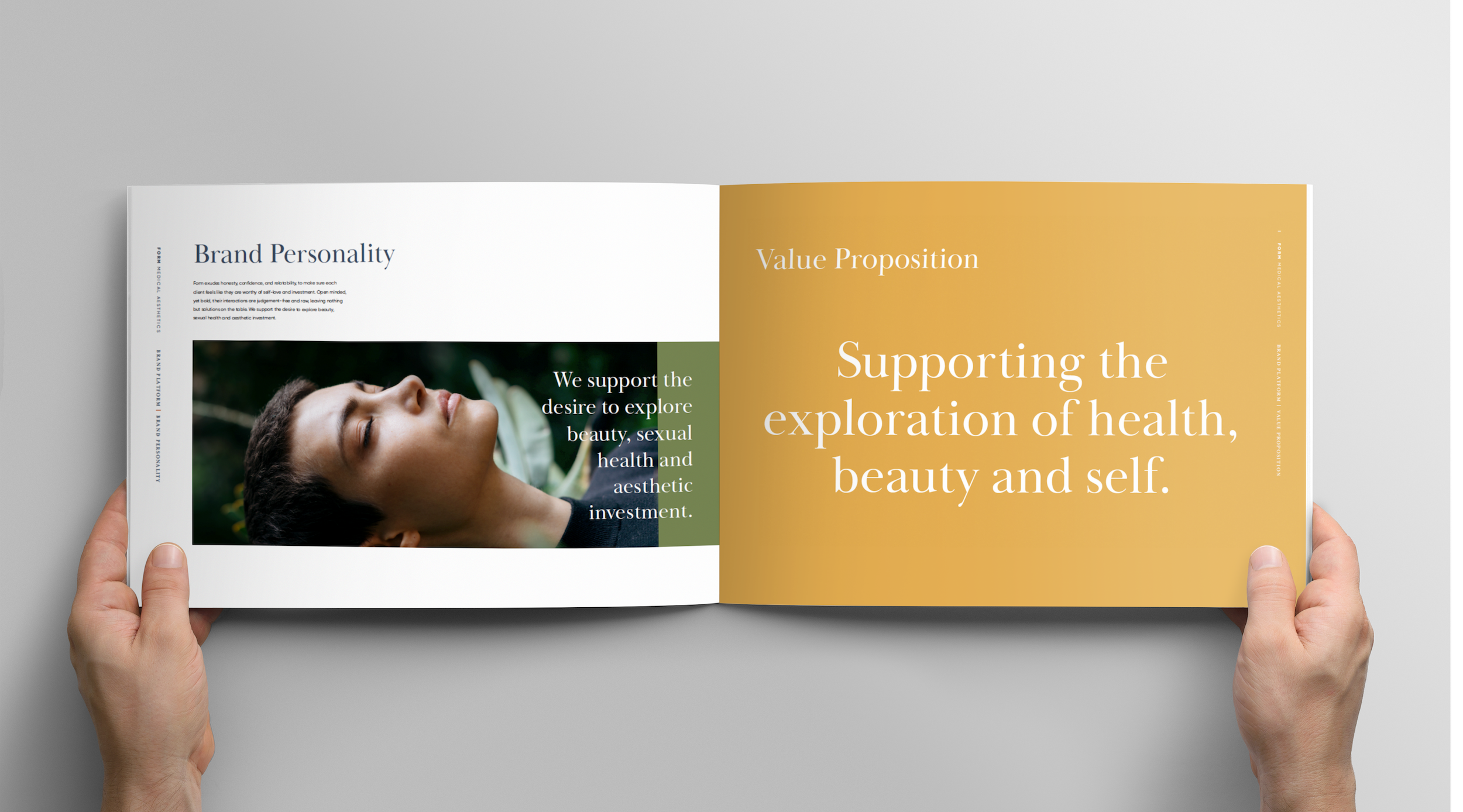
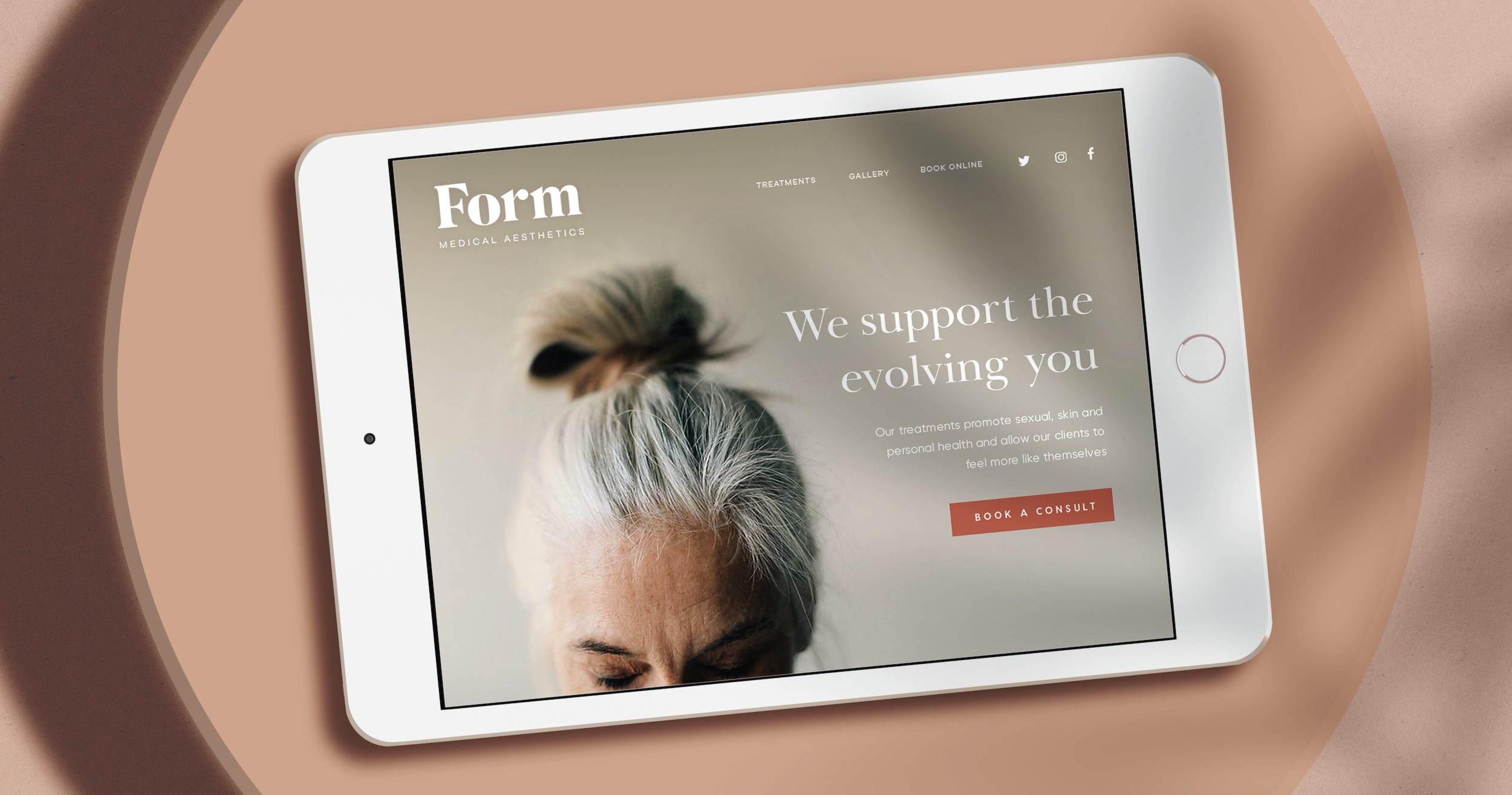
The brand strategy centred on celebrating the evolving self. Unlike competitors who focused on surface-level promotions, Form was positioned as a destination for people looking to invest in themselves, whether for aesthetic reasons, confidence, or personal health. The messaging leaned into education, transparency, and genuine connection. The brand personality reflected that too: honest, confident, relatable, and judgment free.
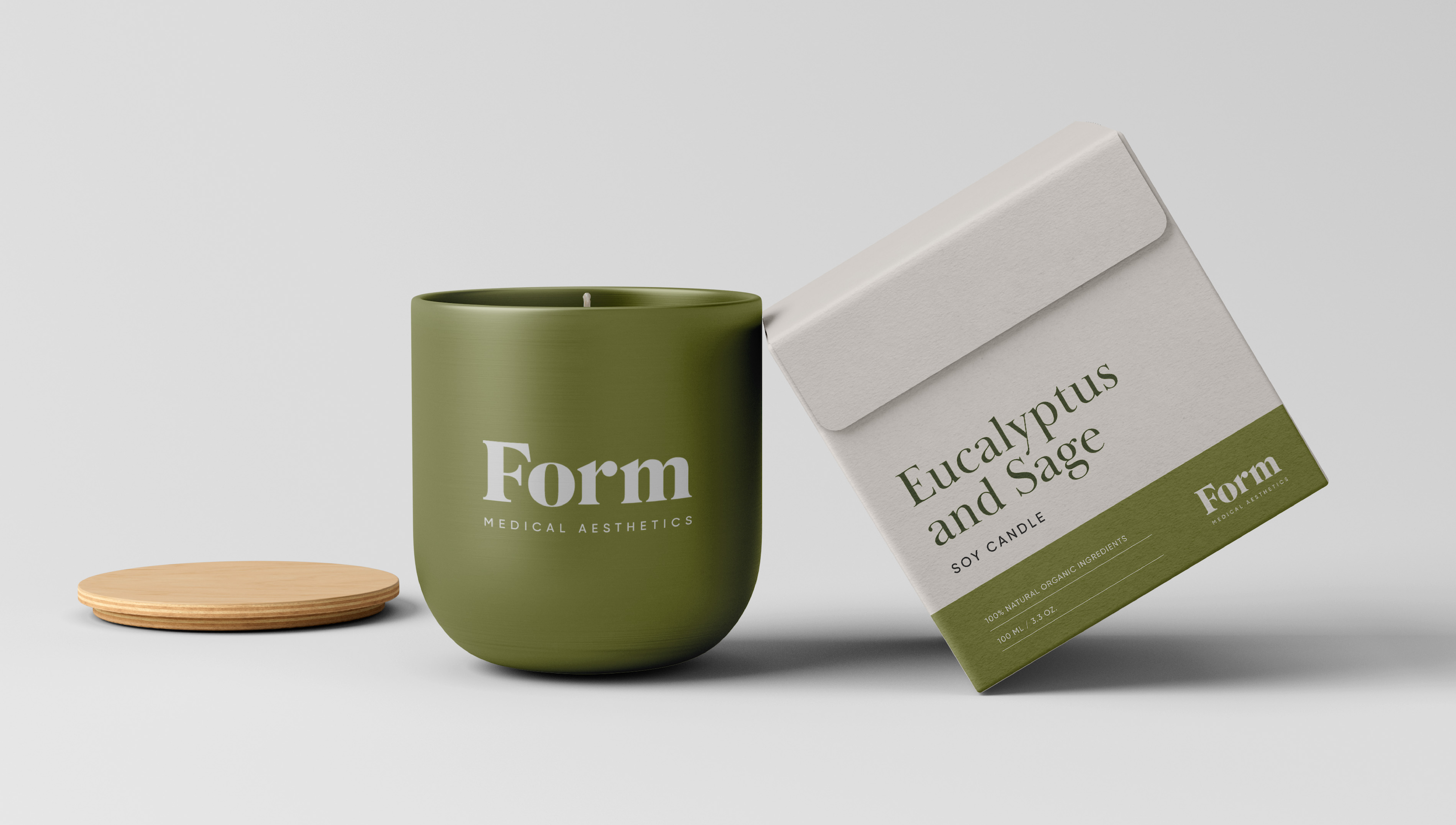
Visually, the design system was built to be as adaptable as the people it served. Rooted in the idea of constant evolution, the identity used a rich and curated colour palette inspired by skin tones and earth elements to reflect diversity and grounding. It was not static. It evolved. The logomark was confident and minimal, while a custom typeface added depth, character, and trust. The overall system was flexible enough to grow with the clinic’s offerings, yet intentional enough to make a lasting impression.
Form launched with a clear strategy, a meaningful name, and a robust design toolkit. The result was a brand built to lead, not just in aesthetics but in culture. It laid the foundation for normalizing conversations around self-improvement, beauty, and care. With clarity, elegance, and inclusivity, Form now shows up in the world as a safe place for the evolving self.


.svg)
hello@brandishagency.com